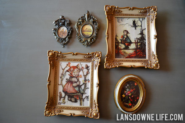
How many times have you been at a thrift store and seen framed art like this? All the time, right? And although pieces like this are usually only a dollar or two, you pass them up because the art is old or ugly…
Stop doing that! You can liberate that weird artwork and reuse the frames. It’s super easy. Let me show you.
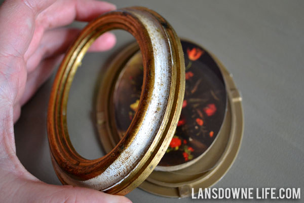
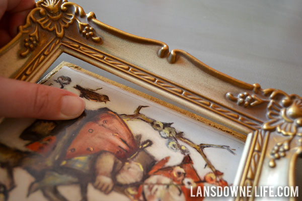
If you’re piece has glass (or a clear plastic film acting as glass), hooray! Gently pop out the back. Don’t be afraid! Sometimes they are glued, but even so, it’s usually easy to do.
Insert some art or a photo to fit and reassemble the frame. You may need to use glue or some sort of adhesive to secure the backing; use a couple of drops. Don’t go crazy. This frame was plastic and popped apart and back together easily without any glue.
If your frame doesn’t have protective glass, don’t fret. You can still use it like a normal frame.
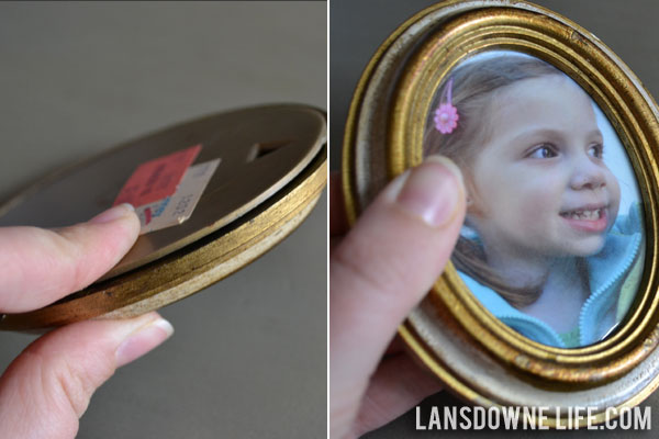
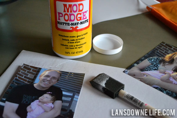
First, pop out the back. Then find some art. If you print a photo from your inkjet printer like I did here, you’ll need to take an extra step to seal it.
Before using them in a project, I always spray my ink jet photos with a water resistant clear acrylic sealer. Do not skip this step! Without the water resistant clear sealer, applying other products like Mod Podge to the photo will make the ink from an ink jet print run. So now you know. Don’t skip that step unless you want an inky runny mess.
I wanted a more durable seal (i.e. one that I could dust and not worry about ruining the photo), so I applied a very thin coat of Mod Podge to the surface of the photo and let it dry.
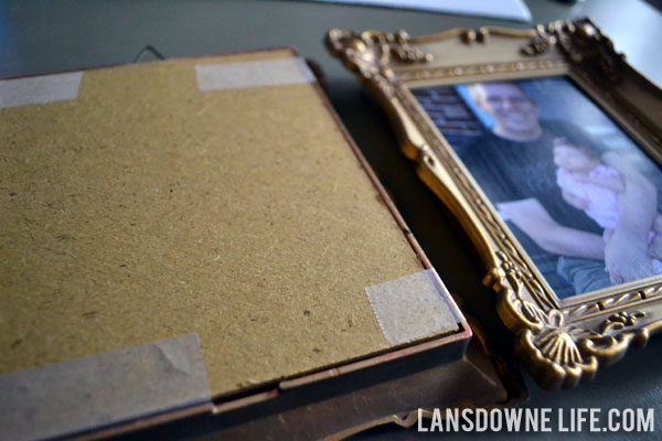
Sandwich the frame back together and secure with tape or a tiny amount of craft glue. I wanted to reserve the right to swap out these photos in the future, so I used scotch tape here. The frames and contents were very light and naturally sort of wanted to stay together on their own, so I didn’t need anything stronger here.
Feel free to use duct tape or packing tape in lieu of glue, if the situation can handle it. No one’s going to see the backs once the frames are on the wall.



Can you tell me the brand & the name of the color you used in your dining room? I’m painting my kitchen orange, the first real bold color I’ve ever used on a wall as I usually go with neutrals and or muted tones. I keep debating how bright to go but am leaning towards the same shade of orange you used. Do you like it still? Did it take some getting used to?
Hi Julie,
The color I used was Olympic’s Wet Coral. (Olympic paint is sold at Lowe’s.) It’s more of a dark coral than a straight orange. It appears a bit orangier in the photos, I think. Check the swatch from the store, and you’ll see what I mean.
I don’t think it took me any getting used to, but I’m not really shy about bold colors. Maybe just buy a small sample and paint it on a poster board to give yourself a better idea of how it will look in your kitchen?
It’s funny that you ask, because while I do still like it, I was considering repainting my living and dining room a different color altogether. I painted this in 2008 though, so mostly it’s just me ready for a change.